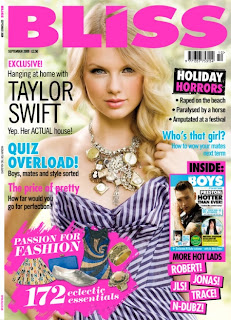

The name of the magazine 'Bliss' is very bubbly; I think this because its bold, curvy, funky and in a bubblegum-ish pink, it looks as if a teenage girl would of created it.
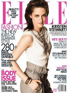
The name of the other magazine is 'ELLE'; all in capitals which states its serious however each letter is thin, in bubblegum pink and a unique type of text. Each letter is separate to each other suggesting its individual with a strong statement, so it stands out giving away how the magazine is like inside. Both magazines are for girls but by this you can tell by the type of girl -age, maturity, interests. So the massive difference here is the title of both magazines.
Bliss and ELLE have the same amount of left&right hand 3rds but there's a difference between the structure of it; the the left and right hand 3rds on Bliss has many types of texts, colours and sizes to relate to the storylines (That has got to do with fashion and boys - That's what girls want) either by itself or in a messy almost rushed and stuck on box (wasn't planned until last which relates to the target audience) although ELLE is all the same type of text also same two colours used again (planned, organised like their target audience) ELLE, its more aimed at a young adult audience who are interested into fashion ( The percentage of that is mostly women- Kristian Stewart as the cover helps give that away) which is why its more serious however not boring because it has an appealing colour theme.
And finally Taylor Swift is on Bliss since she is known to be very popular to all teenage girls; teenage girls are the target audience for Bliss so having Taylor Swift attracts them making them want to buy the magazine. She has given direct address to audience. Same with ELLE except Kristian Stewart is modeling a very simple but elegant outfit giving direct address to audience aswell.
